
Hello! Today I'm talking on Pink Paislee blog about white space combined with color. As you may already know I am a huge fan of white backgrounds in scrapbooking; I have been this way ever since I started my scrapbooking adventure. Now I want to share my process for creating with “white” with all of you.
First of all white is the most neutral color we can imagine. It matches every other color you pick. On a white base you can build either very colorful and happy designs or ‘color washed’ pastel designs. While using white card stock as my base it gives me the freedom to mix and match other colors. I use colors I never thought I would. I discover new color connections. Just think of this like a white blank sheet of paper where you can write whatever you want..

Building a page on white card stock really starts in my mind. I always look at the photo first. This is the most important part of my project and I always say that no matter how many great scrapbooking supplies I use, my photo must come first. There is no way I can make beautiful scrapbook pages with a photo that doesn’t tell a story or isn’t important to me. And believe me, I have tried and I failed. While creating you show your emotions, your sensitivity and you must tell the truth through your creations.

Look on the color wheel below. If we use colors that are contiguous (like orange, yellow, green) we will make the page looks harmonious. If we use opposite colors like red and blue, it will looks more colorful and dynamic.

As you know white cardstock can have different textures and shades so I often play with mixing and matching various types of white papers to make monochrome pages. It’s fun too! Although it’s quite hard and even harder to photograph it
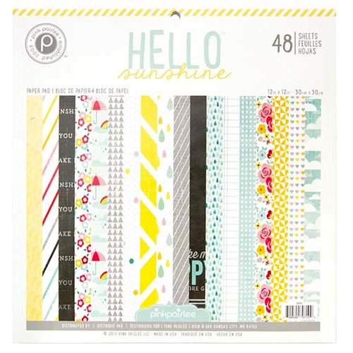
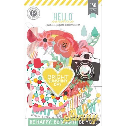
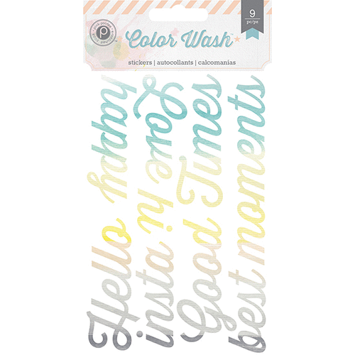
For today’s project I used a photo that contains such colors: yellow, green, red, aqua and lots of white. I used Hello Sunshine (again..I know..I love it!) and the Color Wash collection – because they match my style so perfect! I couldn’t even imagine better collections for me. As you can see the colors popped out of the page – they are bright, strong and very dynamic. Although the most of what you see is white base, the page doesn’t look too white or boring.


No comments:
Post a Comment